top of page

What is OP3N?
OP3N
Introducing Web 3 experience
MY ROLE
UIUX designer
OP3N is a B2C E-Commerce and Community platform, bridging the gap between Web2 and Web3 for GenZ interested in Web3. I led the design of the NFT purchasing experience. The redesign garnered 5000 new users within a four-month.
Team
2 Project manager, 3 designers, 10+ engineers
TIMELINE
Aug 2022 - Nov 2022
Overview Of The Redesign Experience

Desktop - Dark Mode - Community - Home Page

Mobile - Light Mode - Merchandise - Home Page

Mobile - Dark Mode - Ticketing - Home Page


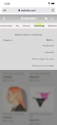
Intuitive Navigation


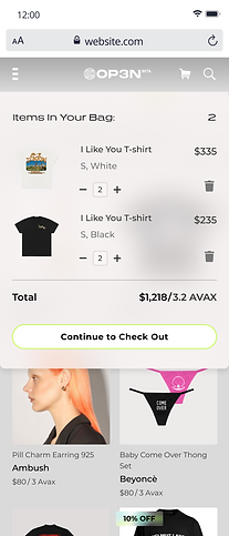
Seamless Shopping Experience


Cohesive Design System for Dark and Light Modes
Case Studies of my focus areas during the redesign
Click One To Know More
Effortless Content Discovery and
Meaningful Engagement
Community Engagement
Informed Checkout and Flexible
Payment Options
Ecommerce - Checkout
Intuitive and simple Navigation for a
powerful platform
Menu, Filter and Sort features
Cohesive Design System for Accessibility and Efficiency
Design System

Effortless Content Discovery and Meaningful Engagement
Problem Statement
Our users join our platform to connect with their favorite creators. However, our current approach lacks an efficient strategy to fulfill this need. How might we design a platform that presents personalized content and provides immediate updates to enhances connections between users and creators.
Breakdown Of The Problem
🧭 Inefficient navigation
New users find hard to locate projects and engage in activities they are looking for
🖐️ Minimum Participation
Limited activities to increase usage time or retain users
👀 Insufficient Updates and Activity Visibility
Users lack timely information about live sessions, chatroom interactions, and NFT launch sales

Overview Of The Old Experience

The Old OP3N Home Page
Lack of onboarding or guidance to introduce the platform
Inefficient for users to locate their interested project from the vertical scrolling feed
Lack of guidance for locked items, leaving users without a clear path to continue their experience on the platform
Information overload, with a visually challenging interface for users to prioritize content they are looking for
Inconsistency of icons and feature entry from the home page leading to confusion


Due to budget constraints, we implemented a support channel during the initial launch. This channel allowed our users to actively communicate any issues they encountered to enhance our product design. The comments we received served as valuable data points that informed our redesign process.
process
We kicked off the process with a comprehensive experience review of the current experience with the product triad.
Key Takeaways
We took a strategic decision to intentionally position OP3N for followers to amplify growth.
The platform's unclear information architecture caused navigation difficulties.
User challenges with new product features highlight the need for improved onboarding.
An end-to-end visual and usability refresh to make OP3N enjoyable and engaging.
Design Goal

Engaging
Captivates users and encourage their participation

Simple
Straightforward guidance and help users complete task efficiently

Coherent
Focusing on user jobs and consistent user experience
Users
OP3N is used by both followers and creators. A significant portion of followers initially joined OP3N due to their interest in creators who release projects on the platform. Our primary objective is to enhance the follower experience by facilitating easy discovery of their desired projects, seamless purchase of related content, fostering connections with creators, and providing opportunities to explore other projects available on OP3N.

Creator
Creators on OP3N are to showcase their projects and offer associated products. Creators hope to establish meaningful connections with their fans, thereby enabling successful product sales.

Follower
Followers on OP3N actively seek to support for their admired creators. They aspire to foster closer relationships and gain access to exclusive content from these creators.
Process
Identifying and prioritizing user jobs.
A comprehensive list of user jobs across personas were framed and stack ranked. This exercise laid the foundation for our MVP.
An example of the Job-To-Be-Done for OP3N to capture user jobs and needs
Actor
As a follower
Situation
When I discover new projects and connect with creators I admire
Motivation
I seek to explore content and build relationships with creators
Outcome
I engage in discussions and gain access to exclusive content
Process
Bucketing user jobs into the stages of the user journey
Enrolling our triad into our design workshops worked out wonderfully as our engineers and program managers with extensive product knowledge in web3, existing OP3N users, and the platform's backend infrastructure brought diverse and comprehensive perspectives to the table. Together, we charted out a plan for the revamp. By leveraging our collective expertise, we ensured a well-rounded strategy that considered multiple facets of the product.

Explore
Users discover OP3N and its diverse range of creative projects
Users explore the platform to find content that align with their interests
Engage
Users follow creators whose work resonates with them
Users join communities and engage with the creators
Support
Users engage with creators through live sessions and chat
Users show support by purchasing exclusive content
Stay Informed
Users receive notifications and updates on creators and projects
Users stay informed about the releases, events, and news
Enjoy
Users enjoy the unique content and experiences
Satisfied users recommending OP3N to their network
Solution
Final Outcome: Highlights
Each highlight captures an aspect of the new OP3N experience. It calls out which design goal it adheres to, what user scenario or problem its solving and what the solution is.


Design Goal: Simple
Streamlined Exploration: Intuitive Navigation and Informative Content
User Scenario: Explore
Users visit OP3N to explore and learn about specific creators and projects. Our goal is to provide an intuitive experience that allows seamless navigation, captivating project discovery, and understanding of their favorite creators' work.
Solution
Our landing page features an attention-grabbing call-to-action button and a user-friendly selection menu for effortless navigation and content discovery. Prioritizing simplicity and intuitiveness, we offer a seamless browsing experience that promotes exploration and user satisfaction.
Design Goal: Engaging
Engage Users with Timely Updates, Live Interactions, and NFT Sales
Problem: Stay Informed
Users lack timely information about live sessions, chatroom interactions, and NFT launch sales, which hinders their ability to effectively engage with creators on OP3N.
Solution
We prioritize users' preferred communities, prominently displaying them for easy engagement. Tags like "live" and "chat" indicate real-time interactions, encouraging active participation. We provide updates on new community releases, keeping users informed. For NFT launch sales, we showcase recent sales and include countdown timers, enhancing user engagement. Users can also preview upcoming NFTs, fostering excitement.


Design Goal: Engaging
Enhance Engagement with Creators with Live Sessions and Chat Interactions
User Scenario: Support
Users on our platform aspire to build connections and learn more about their admired creators. They seek an effortless way to engage in activities hosted by these creators.
Solution
At the top of the page, users are promptly notified about live sessions organized by creators. By simply clicking on the profile image adorned with a "live" tag, users can seamlessly join the live session and actively participate in real-time conversations through the integrated chat feature. Additionally, users are presented with a curated collection of associated NFTs, providing them an opportunity to support their beloved creators and preview upcoming sales.
Design Goal: Coherent
Unified Presentation of Diverse Digital Assets Across Different Stages
User Scenario: Support, Stay Informed
Users want to explore the diverse content offered on the OP3N platform. They navigate through different sections such as communities, merchandise, and ticketing, seeking a seamless experience that maintains a consistent OP3N vibe. Users should be able to easily differentiate the various types of content they encounter and understand how to interact with each of them, while still feeling a cohesive and unified experience throughout their journey.
Solution
We designed rich and consistent cards for presenting varied content on OP3N. Visual cues like tags and text help users distinguish content types based on interests or goals. The cards offer clear pathways for intuitive interaction based on user preferences and intentions.


Simplifying the OP3N Experience: Intuitive Navigation for a Powerful Platform
Problem Statement
As we continue to enhance the OP3N experience by adding new functionalities, we faced a challenge of balancing empowerment and usability. The addition of numerous functions had the potential to confuse users and complicate their overall experience. Our goal was to empower users in their OP3N journey while ensuring seamless and intuitive navigation.
Breakdown Of The Problem
⏳Long searching time for intended content
Prolonged searching times when users try to find intended content, resulting in frustration and a diminished user experience.
🤔Potential confusion due to numerous added functions
The addition of functions had the potential to confuse users and complicate their overall experience.
Process
Defining stages of User Journey
To improve the navigation experience and accurately empathize with our users, we defined and analyzed the stages of their navigation journey.
User Journey Map - Exploration
Actor
user of the OP3N platform who wants to find specific content related to a particular artist
Scenario + Expectations
The user is looking to explore products within the OP3N platform. They have a specific artist in mind and expect to easily find relevant content without spending excessive time searching.
Discovery
Filter
Exploration
Actions
Navigates to OP3N and selects the desired feature page
Utilizes filtering options to narrow down the content
Interacts with the filtered content and gathers information
Mindset
🧐 Curiosity and eagerness to explore relevant content
🎯 Seeking personalized and targeted results
🤔 Evaluating options and making informed decisions
Emotions
🥳 Anticipation, excitement
🧘 Determination, focus
☺️ Engagement, satisfaction
Opportunity
Ensure the main menu is prominently displayed for easy access to different feature pages.
Provide specialized filtering options, such as searching by artist name or category, for each feature page
Design an intuitive layout for product listings, presenting key information clearly and attractively
By understanding the user's actions, mindsets, and emotions throughout the user journey, we identified opportunities to improve users overall navigation on OP3N. These opportunities include enhancing the discovery and access phase, providing specialized filtering options for refinement, and designing an engaging layout for content exploration and selection.

🤔
User intention
Discovery
💡
Exploration
Filter Selection
Narrowing
🧐
Updated Content
Interaction
🥳
Solution
Final Outcome: Highlights
The final solution we developed for OP3N ensured a consistent alignment with users' goals at every stage of their navigation journey.

Mobile - Dark Mode
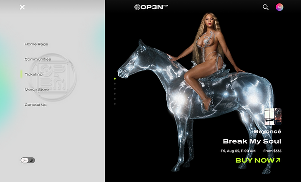
Desktop - Light Mode
User Journey: Discovery
Main Menu
Problem
Users can't quickly access their intended content with the addition of new features
Solution
We introduced a main menu option at the top of the page, allowing users to navigate effortlessly between different features. This menu served as a central hub for accessing various sections of the platform, enhancing overall navigation efficiency.
User Journey: Explore
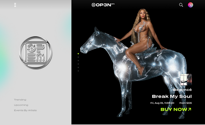
Shortcuts to Different Sections
Problem
Users need a quicker way to access different sections within a feature page
Solution
We implemented shortcuts on each main feature page, providing users with quick links to different sections such as featured content, trending items, or artist-specific sections. These shortcuts reduced the time required to reach desired content, improving user satisfaction.
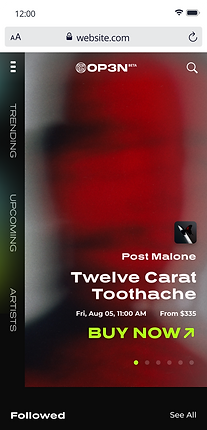
Mobile - Dark Mode
Desktop - Light Mode

Merchandize - Home

User Journey: Filter Selection
Artist Name Filters
Problem
Users hope to quickly locate content by their preferred artists
Solution
We implemented the ability to filter products based on artist names. This feature catered to users who had a preference for particular artists or wanted to explore merchandise associated with their favorite creators. By providing this filtering option, we facilitated a more personalized and targeted browsing experience.
Merchandize - Filter by Artist
User Journey: Narrowing
Categorical Product Filters
Problem
Users struggle to navigate and find specific product types within the merchandise page
Solution
We simplified product access by incorporating categorical filters, enabling users to easily navigate to specific product types such as accessories, art, decor, or clothing using the top tab menu. This streamlined approach saved users time and improved their shopping experience.


User Journey: Updated Content
Clear Navigation Feedback
Problem
sers can get disoriented or lose track when using multiple filters
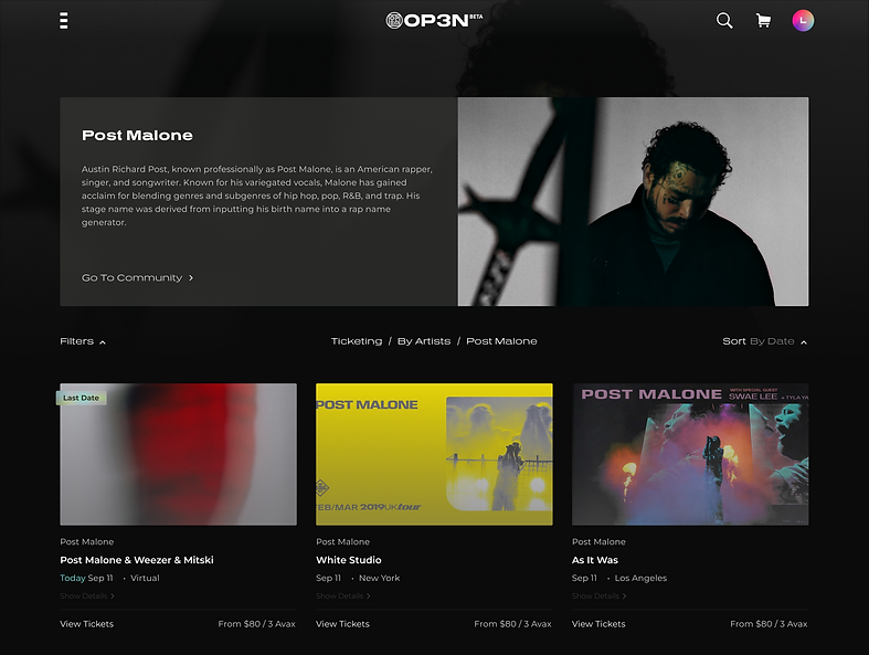
Solution
Users are informed about the page name and path above the product listing, ensuring a clear understanding of their current location within the platform. This way, even when users have applied multiple filters, they can easily track their progress and know the context of the displayed content.

Seamless Shopping: Empowering Users with Informed Checkout and Flexible Payment Options
Problem Statement
The absence of a shopping cart limited users to one item purchases, resulting in a fragmented shopping experience. Users can now easily add multiple items and have full visibility of their selections. Our approach accounts for the diverse nature of our offerings, encompassing both merchandise and ticketing. We also offer flexible payment methods, allowing users to switch between options. These improvements empower users, ensuring a seamless and informed shopping journey with complete control over their purchases.
Breakdown Of The Problem
🤯 Fragmented Shopping Experience
Users were restricted to purchasing one item at a time, leading to a fragmented shopping experience that required multiple transactions.
🖐️ Lack of Visibility and Flexibility
Users had difficulty reviewing and managing their cart contents, with limited visibility and editing capabilities during the checkout process.
🆕 Addition of new products
Recognizing the need for specialized checkout flows for different product categories like merchandize and ticketing, our key focus was to maintain a consistent user experience throughout the purchase process.

Overview Of The Old Checkout Flow
Select NFT

Limited to purchasing one item at a time, with no option to edit quantities
Select NFT

Limited and inflexible cryptocurrency payment options
Select Payment Method

Unclear progress indicators, causing confusion for users
Select Payment Method

Complicated connection process, multiple steps and uninformed waiting period
Payment Method: Fiat

Disrupted user experience due to reliance on third-party payment methods
Payment Method: Fiat

Lack of purchase information, of the benefits they receive from purchasing the NFT
process
We conducted a comprehensive product triad review, involving our cross-functional team and secondary research, to ensure the best user experience for our users on OP3N's checkout.
Design Goal
🕹️ Enhance Control
Empower users over their purchases, allowing them to make adjustments to quantities and tailor their orders according to their preferences.
👀 Improve Visibility
Improve visibility to empower users with a clear understanding of their selections and pricing information, enabling them to make informed decisions.
☺️ Seamless journey
Seamless and user-friendly checkout journey to enhance overall satisfaction, ensuring users a smooth experience when completing their purchases.
Solution
Final Outcome: Highlights
Each highlight captures an aspect of the new OP3N experience. It calls out which design goal it adheres to, what problem its solving and what the solution is.

Merchandize - Desktop - Dark Mode

Ticketing - Desktop - Dark Mode - Select Date

Design Goal: Enhance Control
Flexible Cart Editing
Problem
Unable to edit items once users entered the checkout process, resulting in users abandoning items they intended to purchase
Solution
We increased users flexibility to edit their products directly without leaving the cart. We addressed the previous limitations and improved user control.
Merchandize - Mobile - Light Mode

Ticketing - Desktop - Dark Mode - Select Tier
Design Goal: Improve Visibility
Clear Progress Indicators
Problem
Previous versions of the checkout flow had ambiguously named steps, causing confusion and hindering users' understanding of their progress.
Solution
we designed visual representation of their progress to easily understand what was expected and navigate through the checkout process with confidence and clarity.


Merchandize - Mobile - Light Mode
Ticketing - Desktop - Dark Mode - Select Tier


Design Goal: Improve Visibility
Transparent Purchase Summary
Problem
The absence of purchase information made it challenging for users to verify their selections and confirm their purchase with confidence.
Solution
we designed a transparent purchase summary sticked on the right of the screen to provide users with constant visibility of their cart contents.
Design Goal: Enhance Control
Flexible Payment Options
Problem
Users were redirected to external platforms to finalize their transactions which disrupted the user experience and caused inconvenience.
Solution
we designed flexible payment options for users to easily switch between credit card payment and cryptocurrency payments. Users can also quickly make payments directly through their connected wallets


Design Goal: Seamless Journey
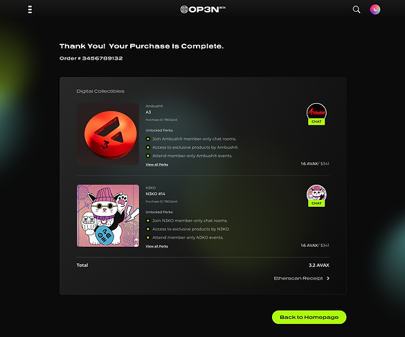
Personalized Confirmation Pages
Problem
After completing a purchase, users lacked a comprehensive view of their items and the associated benefits. Additionally, the confirmation pages were not tailored to each product type, leading to a disjointed experience.
Solution
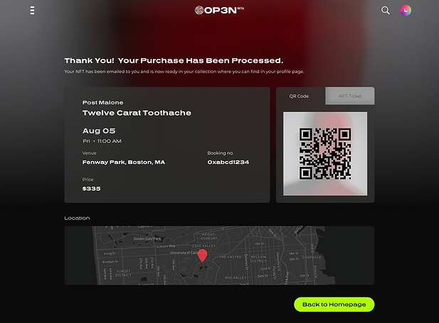
Upon completing a purchase, users now have a comprehensive view of their purchased items and the benefits they will receive. For NFT purchases, the confirmation page invites users to enter the chat room associated with their purchased NFT, fostering community engagement and further exploration.
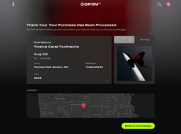
Solution
For ticket purchases, the confirmation page provides access to both the event ticket and the NFT included with the ticket. Users are also provided with event details and the flexibility to easily look up the event location on OP3N. These personalized confirmation pages ensure a cohesive and tailored experience for users, enhancing the overall journey on OP3N.

Unifying the OP3N Experience: Creating a Cohesive Design System for Enhanced Accessibility and Efficiency
Problem Statement
With new functionalities added to OP3N, users experienced a fragmented experience navigating multiple pages. To address this, we designed a comprehensive design system. Our goal was to establish a consistent and accessible user experience, incorporating best design patterns and accessibility guidelines. The implementation of this design system not only provided a seamless user journey but also improved our design team's efficiency with standardized components and guidelines.
Process
📑 Define & Document
We began with team meetings to define essential components for the documentation, establishing a foundation for the design system and outlining iterations to address OP3N's various problems.
🔄 Refine & Iterate
To ensure platform’s continuous growth and adaptability, we iteratively refine our design components based on best practices and new feature development.
👩🏻🏫 Share & Educate
We used a dedicated slack channel to to facilitate collaboration and knowledge sharing within the team in utilizing the components in expressing the brand value of OP3N.
Design Goal
Our design system solution encompasses comprehensive guidelines including typography, colors, small and large components, and general content guidelines. Created in Figma, the design system supports prototyping by utilizing variances and stages. With a clear, task-focused, and actionable approach, our design system ensures a coherent and consistent user experience, empowering users to easily navigate and interact with the platform.
🔍 Clear
We prioritize clear visual and textual cues, ensuring that users can easily comprehend the purpose and functionality of each component.
📋 Task-focused
Actionable components are strategically placed and clearly indicate their interactive nature, empowering users to perform desired tasks with ease.
✅ Actionable
All actionable components are designed to be visually distinguishable and placed in locations that are easily discoverable.
Solution
Final Outcome: Snippets of the design guideline
Each design system snippet provides a concise overview of the component, including its design, usage guidelines, purpose, and benefits.
Design Goal: Clear
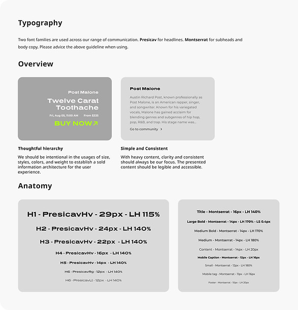
Typography: Thoughtful Hierarchy & Consistency
Solution
To showcase the brand value without compromising accessibility, we incorporated two typography styles. Prescia vHV for concise and impactful messaging, as well as Montserrat for longer paragraphs, ensuring clarity and readability. We defined clear guidelines for the usage of each typography, establishing a hierarchy that aids users in digesting information and promotes consistency across OP3N.
Design Goal: Clear
Color: Consistency & Accessibility
Solution
To maintain consistency across the platform, we developed a set of core colors that serve as the fundamental palette. Considering the presence of both dark and light modes, we placed a strong emphasis on ensuring color consistency while expressing the same brand vibe. Additionally, we prioritized accessibility by carefully selecting colors that maintain high contrast based on the WCAG standards.


Design Goal: Task Focused
General Content: Clear Actions & Consistency
Solution
In all assets, the content is task-focused, guiding users towards desired actions. Task-specific language is used to clearly communicate the purpose of each trigger and provide users with the necessary affordances. Content is align closely with other images and components, maintaining consistency. Additionally, we designed clear differentiation and hierarchy when multiple actions are present on a single page, allowing users to prioritize their tasks effectively.
Design Goal: Task-Focused
Cards:Uniformed Presentation & Familiarity
Solution
As e-commerce plays a significant role on the OP3N platform, we have developed a comprehensive set of cards to showcase various products. By maintaining a consistent design across the cards, we create a sense of familiarity for users. This allows them to quickly grasp and understand the information presented on the cards, enabling efficient browsing and decision-making.


Design Goal: Actionable
Drop Down: Clear Placement & Interactive Elements
Solution
Drop down tabs are strategically placed and easily located, allowing users to quickly access relevant content or functionality. Clear indications, such as visual cues or changes in button states, guide users to take further actions. To cater to users with varying levels of digital knowledge, drop down tabs may include both icons and text, enabling efficient interaction and providing clarity on the available options.

Conclusion
During my tenure at EST Media, we achieved significant milestones in user acquisition and satisfaction. Within six months of launching our first MVP, we successfully onboarded approximately 6,000 new users. This impressive growth continued as we gained an additional 5,000 users within four months following our reimbursement efforts.
The positive feedback from our users on our platform has been overwhelming, leading to a significant decrease in support requests by 68%.
One notable observation from our user data is that 69% of our users did not previously possess a crypto wallet. Through our platform's introduction to the Web3 community, we successfully encouraged these more conservative Web2 users to explore and embrace the new and trending concept of cryptocurrency.
I am proud to have contributed to this transformative journey, introducing users to innovative technologies and fostering their engagement within the Web3 space. The results achieved at EST Media demonstrate my ability to drive user adoption, enhance user satisfaction, and effectively bridge the gap between traditional and emerging technologies.
bottom of page


